
Diabetes Management App
Help diabetics understand what impacts their blood glucose data
OVERVIEW
After participating in an ethnographic study about Type 1 diabetics, I have a better understanding of their problems and needs. This project is proposing a potential solution to make Glooko's mobile app more useful and usable.
MY WORK
UX Design, User research
BACKGROUND
To manage diabetes, there are two steps: combine different types of data (e.g. glucose, food) in one platform and conclude what diabetics should (not) do from the data collected.
The current app focuses on connecting with various blood glucose meters and helps diabetics log their meals, exercise, and medication. There is a growth opportunity if it can provide more actionable insights for users.
The redesign helps users extract these insights by improving the usability of adding and reading data and allowing people to search in the history data.
PROCESS

RESEARCH
How to be more usable & useful?
In this phase, research has two goals: improve usability and improve usefulness. To improve usability, testing and evaluation on the existing solution are valuable. For usefulness, it is more important to talk to users and stakeholders.
Heuristic evaluation
An expert review on the current experience of logging data.
Competitive Audit
Try out competitors' apps to identify strength & weakness
Enthographic study
Visit people with Type 1 diabetes to talk about their lives and problems
Stakeholder interview
Get insights from experts in diabetes management internally
Some main findings
-
Glooko's advantage over its competitors is that provides a fast and easy way for users to add multiple items at one time.
-
Efficiency is of the first priority. Apart from it, Glooko tries to reduce both physical and mental workload to record data.
-
Users care most about abnormal blood glucose readings and want to know what they eat and do to cause it
-
Users want to know if there are some repetitive patterns in their blood glucose fluctuations after certain events such as eating some food
ANALYSIS
Personas, Scenarios, Task flows
Research helps me understand users and their needs. Based on the research results and created personas, identified two important scenarios and drew two main task flows. This will guide the design in the next phase.
PERSONA

TWO SCENARIOS

Scenario #1
People with diabetes notice some glucose readings that are far out of the regular range. They want to identify potential factors that lead to the risky glucose level and discuss with their doctors.

Scenario #2
People who are newly diagnosed with diabetes start to learn how to calculate how many units of insulin to take based on the number of carbs they eat and when to take insulin. It varies among people.
MAIN TASK FLOW

IDEATION
Sketch & Iterate
During the ideation session, I sketched out different solutions and tried not to be limited to existing patterns or solutions. Then I prioritized the generated ideas based on two principles.

Intuitive and effective
Focus on making the app more useful while making the best use of the existing design components Glooko has in its design library.

Utilize existing resources
The solution should be intuitive and effective. It should simplify, not complicate diabetes management.
FINAL DESIGN
Problems & Solutions
I pick one sketch idea to work on. I created wireframes, high-fidelity mockups and interactive prototypes for testing.
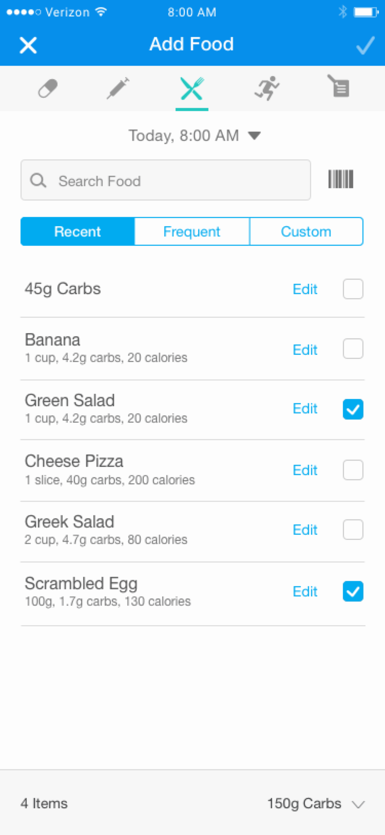
Improve usability of logging
PROBLEM #1: Crowded interface with unclear visual hierarchy
Current interface for adding data is full of information and call-to-actions. There is no clear visual hierarchy and some information is distractive and not necessary.
SOLUTION: Remove unnecessary information and rearrange components
By removing distractive icons and lines and redesigning and regrouping UI components, the interface is simplified with a more clear hierarchy. All the checkboxes are moved to the right side so that users can easily tap to check with only one hand.

Before


After

New interaction to add food
PROBLEM #2: No quick way to review or edit selected events
The current design allows users to add events of different categories at the same time, but it does not show all the selected events in one place. Users have to go through different panels to see if the event is selected or not.
SOLUTION: Display a temporary list of selected events
By adding a fixed panel at the bottom which shows all selected events grouped by categories, users can easily review and unselect events whichever tab view they are on.

Before

After
Remove selected items from the list
Improve usability of history view
PROBLEM #1: Hard to match events on the graph and in the list
Currently, it is hard to match the dots on the graph to the items in the history list below the graph. Users can only read the x and y-axis to know which dot represents which event.
SOLUTION: Allow users to tap on the graph or list
The new design allows users to interact with the graph or the list. By tapping on the event in the list, the event will be highlighted in the graph. Same for the interaction on the graph. This reduces users' mental work on reading and searching tremendously.

Before

After
PROBLEM #2: Tap interaction for the history list is inconsistent and confusing
Currently, tapping on the blood glucose readings in the history list will allow users to add events (e.g. food or exercise) while a tap on other items will edit the items themselves. This is confusing because users are not sure if the readings could be edited.
SOLUTION: Use swipe gesture to add or edit events
Since I use Tap gesture for the interaction between the graph and the list, I decide to use Swipe to edit or delete items in the list. This is a widely used pattern, so it requires less time to learn.

Before (Tap to add or edit)

After (Swipe to edit or delete)
Improve usefulness of history view
PROBLEM #1: Unable to find how previous events impact the blood sugar level
People with diabetes are eager for finding personalized connections between their daily events and their sugar levels. But if the users keep recording all the events every day, the history list will be an endless list which is hard for users to look for an event they did weeks ago.
SOLUTION: Allow the user to search through the history list
The new design allows users to search the history list by using some keywords mentioned in the events. This way, if users wrote down an important note or had a different meal, they can find them easily even after a long time.

Before

After

Search food in the history list
TAKEAWAY
My main takeaway is that for a product to be popular among users, both usability and usefulness are important. A solution designers are constantly pursuing is a solution that best utilizes existing resources and focuses on the major problems to maximize the values brought to users. To arrive at such a solution, designers should keep talking to different stakeholders and think from the perspective of both users and business.

